Bringing Clarity and Trust to Online Medicine Ordering
Sayacare is an online pharmacy that provides affordable, double-tested generic medicines.
I genuinely liked the idea same quality but at way lower prices I studied the experience, ran a quick survey, and redesigned the friction points, this case study captures how the core flows were transformed for clarity and trust

Role
Product Designer
Project Type
Pharmacy, Wellness
Timeline
Oct'25– Nov'25
Tools & Skills
Figma, User Research,
Prototyping
Role/
Research & Design
Performed competitor analysis, conducted 5 user interviews and 2 rounds of user testing, and synthesized insights into actionable design ideas
Impact
Shortly after, presenting the case study to Sayacare founders, they implemented clearer prescription cues in the cart experience.

Problem Discovery/
Backstory
While ordering a prescription medicine through Sayacare, I noticed uncertainty around prescription requirements and order completion. In a flow meant to reduce stress, this ambiguity created hesitation prompting me to explore how clarity and trust could be improved.
Problem
• Users were able to add and pay for prescription-only medicines without clearly understanding prescription requirements upfront.
• Orders were later rejected during verification, leading to confusion, delays, and loss of trust in a healthcare-critical flow.
This highlighted a need for clearer prescription communication earlier in the ordering journey.

Prescription meds are marked as shipped
and later cancelled , if prescription isn't provided.
Challenge
How might we enforce prescription requirements earlier without increasing friction?
Research/
Primary Research
Conversations with frequent online medicine buyers (20-30 years old) revealed confusion around prescription rules, hesitation towards generics, and frustration when next steps were unclear.
Secondary Research
I reviewed Indian healthcare studies, online pharmacy reports, and public research to understand how users perceive prescriptions, generic medicines, and online ordering. This helped identify recurring gaps around prescription clarity, trust, and anxiety during regulated purchases.

65%
trust generic medicines as much as branded ones
60%
are unclear about prescription requirements for online medicine purchases
77%
understand what generic medicines are, but trust remains inconsistent

65%
trust generic medicines as much as branded ones
60%
are unclear about prescription requirements for online medicine purchases
77%
understand what generic medicines are, but trust remains inconsistent
65%
trust generic medicines as much as branded ones
60%
are unclear about prescription requirements for online medicine purchases
77%
understand what generic medicines are, but trust remains inconsistent
Insights from NCBI
Lack of clarity
Users don’t know when prescriptions are required.
Moderate trust
Users remain unsure about generic quality.
Information overload
Too much information makes decisions harder.
Key Insights
Competitor Analysis/
I conducted an in-depth analysis of competitors in the Indian digital pharmacy space to understand how prescription requirements and trust signals are communicated.
Goals
Establish what the market looks like right now. See if there is a direct competitor in this specific idea. Learn how other food scanning apps work.
Result
The analysis showed that while most platforms display an Rx indicator on medicine cards, users are often still allowed to proceed through checkout without completing prescription upload till the payment screen.
Ideation/
Sketch
Before moving into structured flows and UI, I usually explore quick ideas on paper. These rough sketches helped me understand what needed simplifying, how users might move through the prescription flow, and how trust cues could be surfaced naturally.

Rough sketches
Testing & Iterations/
Through 2 rounds of iteration, the product evolved based on real user feedback. These refinements helped improve clarity, trust, and engagement across the core scanning experience.

User flows/
After identifying key friction points in Sayacare’s existing prescription upload process, I restructured the entire flow to reduce user confusion and decision fatigue.

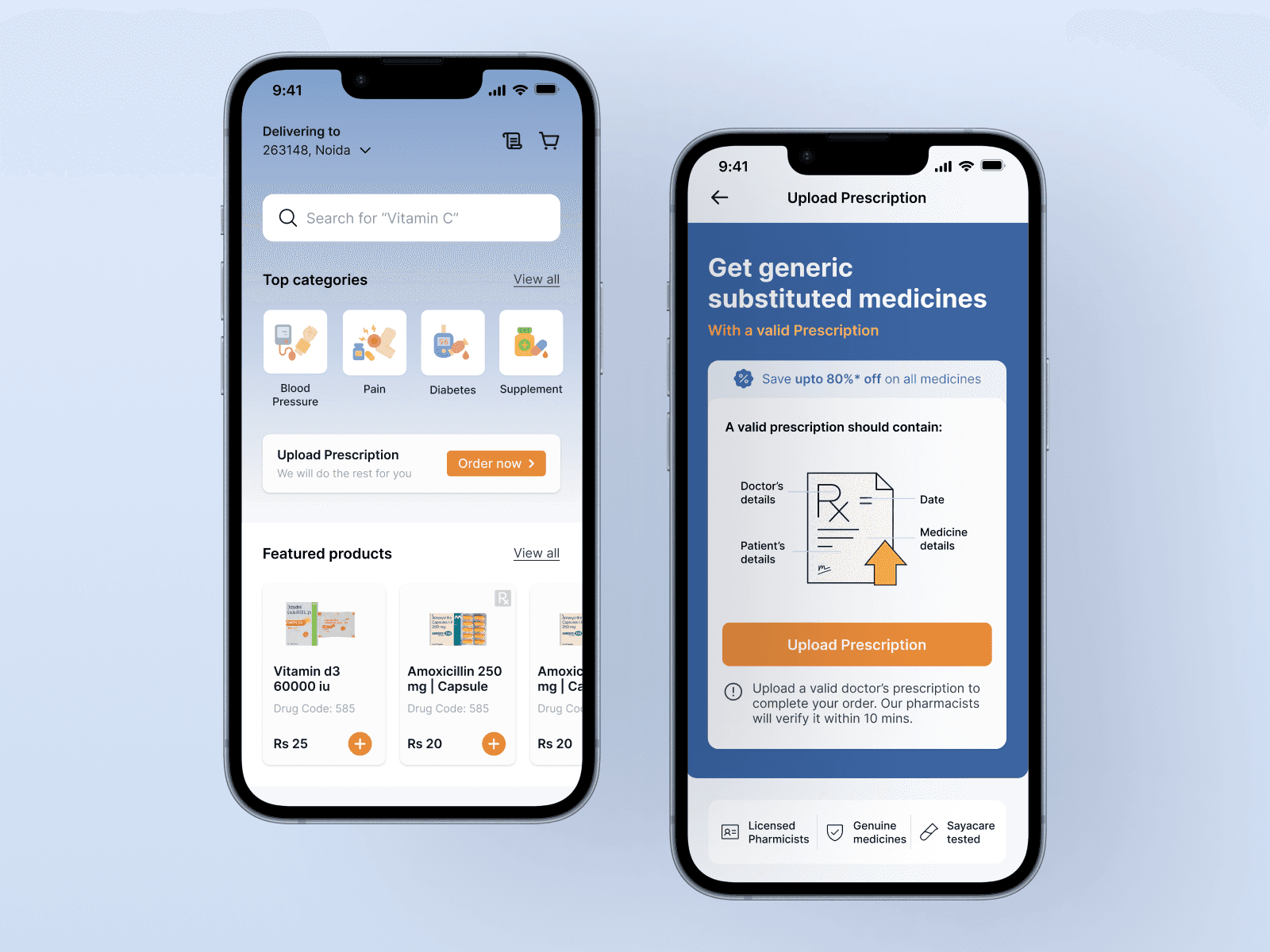
Clarity Around Prescription Requirements
To eliminate late-stage order rejection, prescription requirements were surfaced earlier in the journey. Clear Rx indicators were added at the product level, and prescription upload was enforced before checkout to set accurate expectations.
Upload Prescription Flow
Order flow
Key Learnings/
Designing for trust-critical flows
In healthcare experiences, visual clarity alone is not enough. Allowing users to proceed too far without enforcing prescription requirements increased anxiety and reduce trust.
Clarity over Convenience
By intentionally introducing interruptions (Rx indicators, checkout prompts), the experience became more trustworthy and aligned with offline pharmacy expectations
